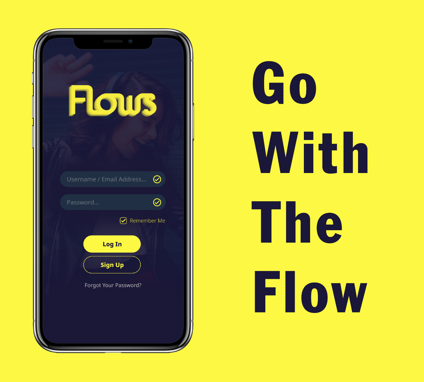
FLOWS
Mobile UI Design (Concept Project)
Role:
UI/UX DesignerTools:
Figma, PhotoshopThe Problem:
Some of the music apps on app stores have very poor functionality and provide a frustrating experience for the user. Some of these issues include buttons and other interactable elements that appear very small and difficult to interact with and pages can appear cluttered.
The Solution:
I decided to design a music app that provides an improved user experience by keeping the overall concept and design of a music app simple, making sure that the interactable elements are easy to interact with and adopting the idea of good and common sense UI/UX design.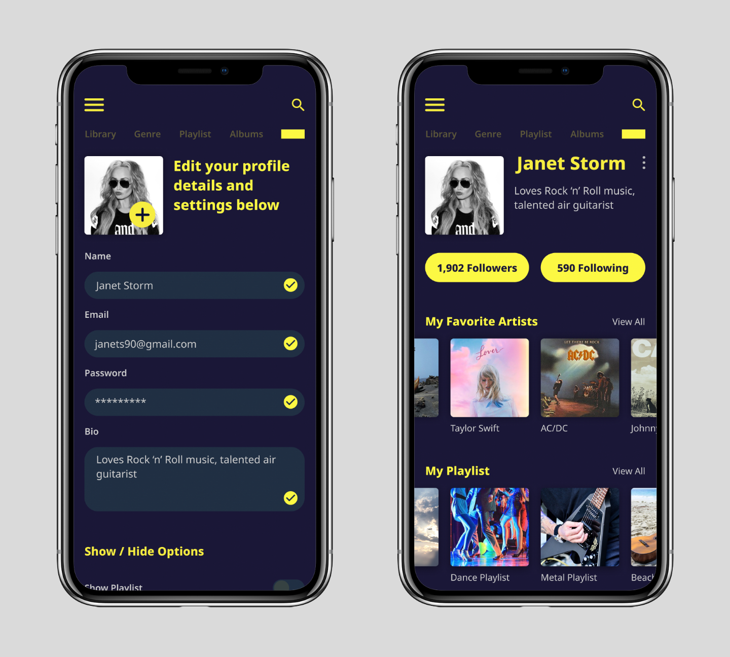
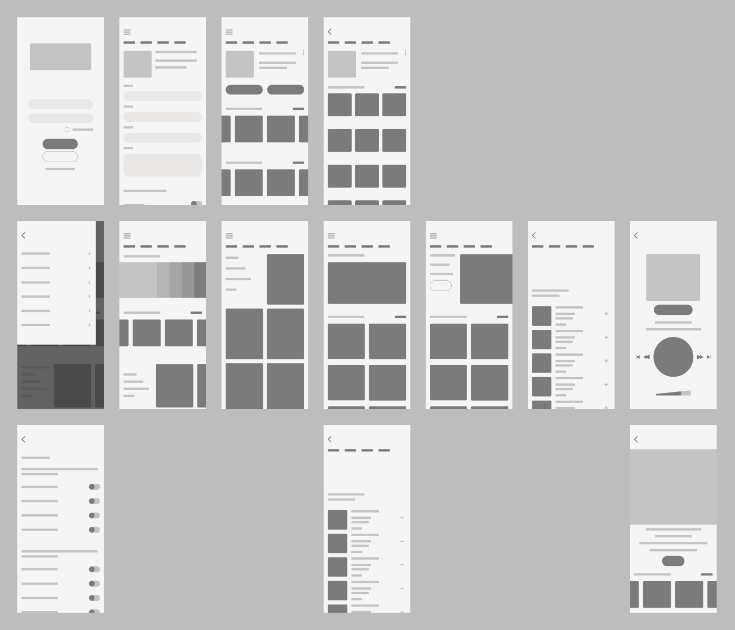
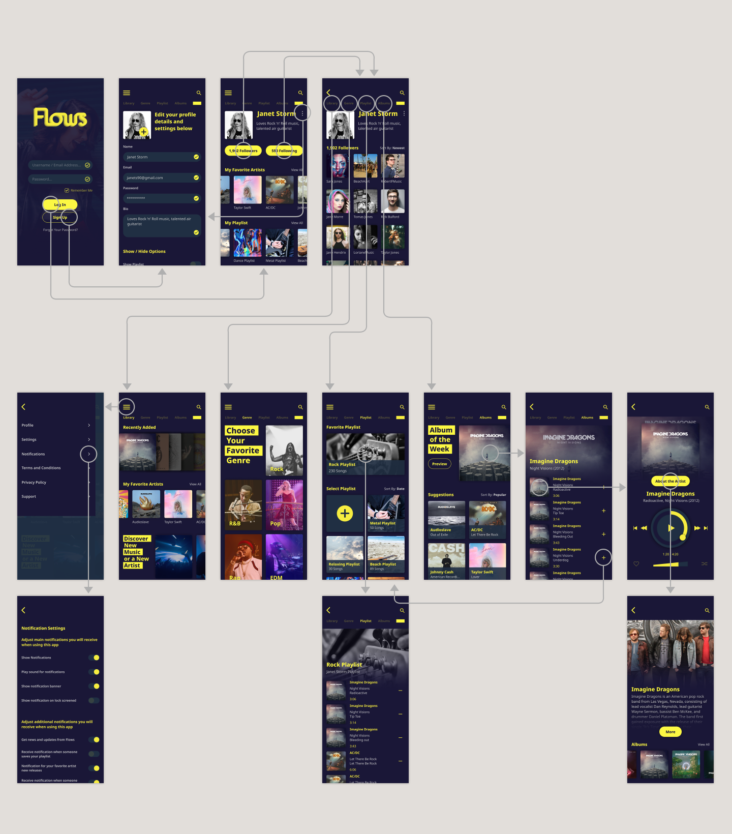
Visual Indicators:
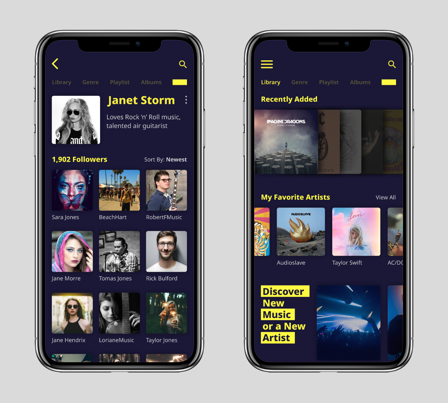
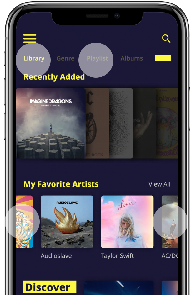
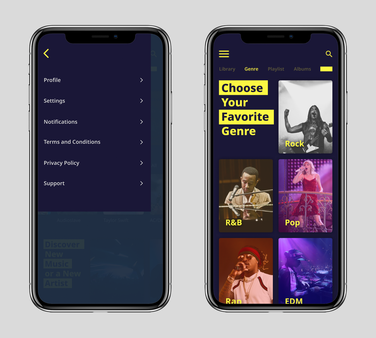
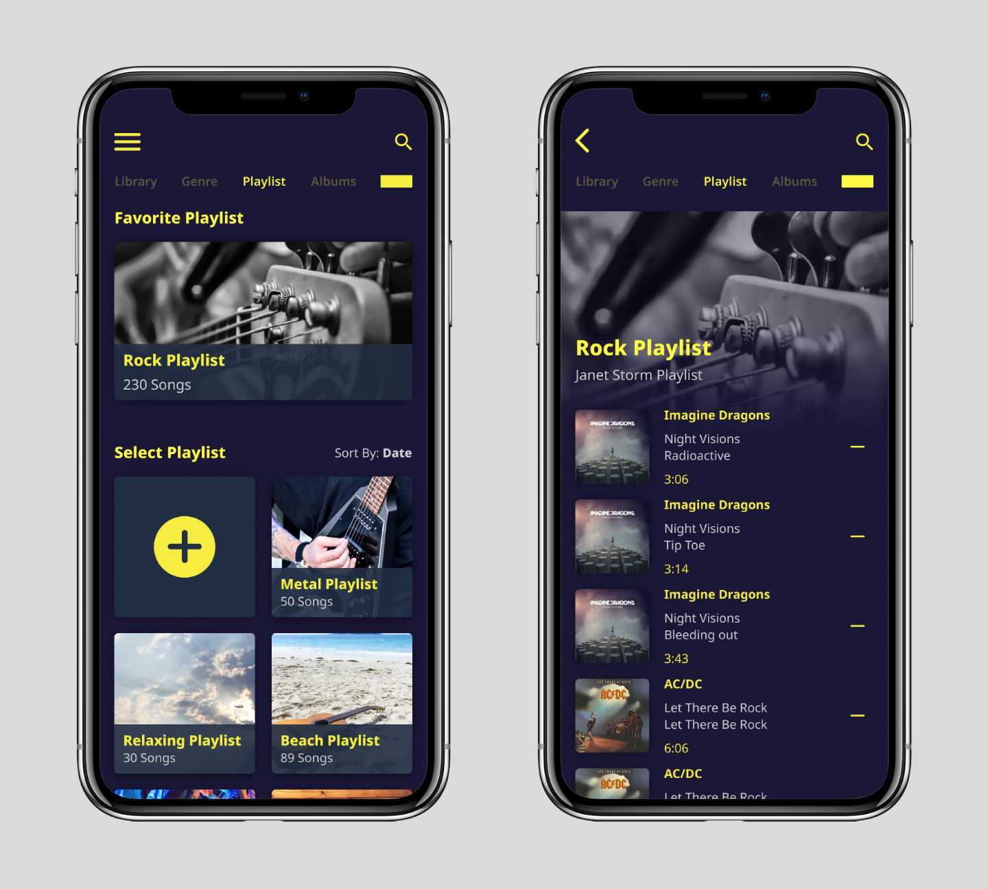
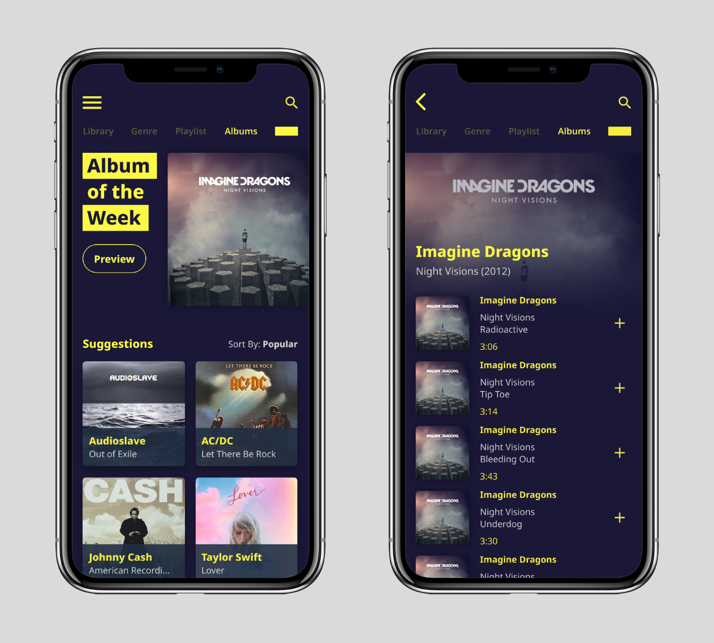
In the navigation section at the top if of the page I lower the opacity of the text for the pages that user isn't on so that they appear less visible while the page that the user is on appears brighter in full opacity to grab the user attention and is also a visual indicator that this is the current page. This prevents confusion by the user about which section of the app they are on.On the library page, I designed it so that the album cover images runs off the screen as a way to indicate to the user that there are more options off the screen and you can swipe left or right like a carousel to see them.
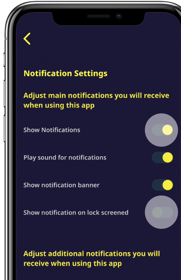
On and Off:
When you lower the opacity of something it's to de-emphasize its importance or indicate that something is turned off. The toggles in the notification settings are in full opacity to indicate that notification is on, but when you interact with it again the toggle changes to a lowered opacity to indicate that it's off. The circular graphic is another visual indicator for on and off and helps reinforce the use of opacity to indicate on and off because when it is off the circular graphic is on the left and when it is on it moves to the right.The Process:
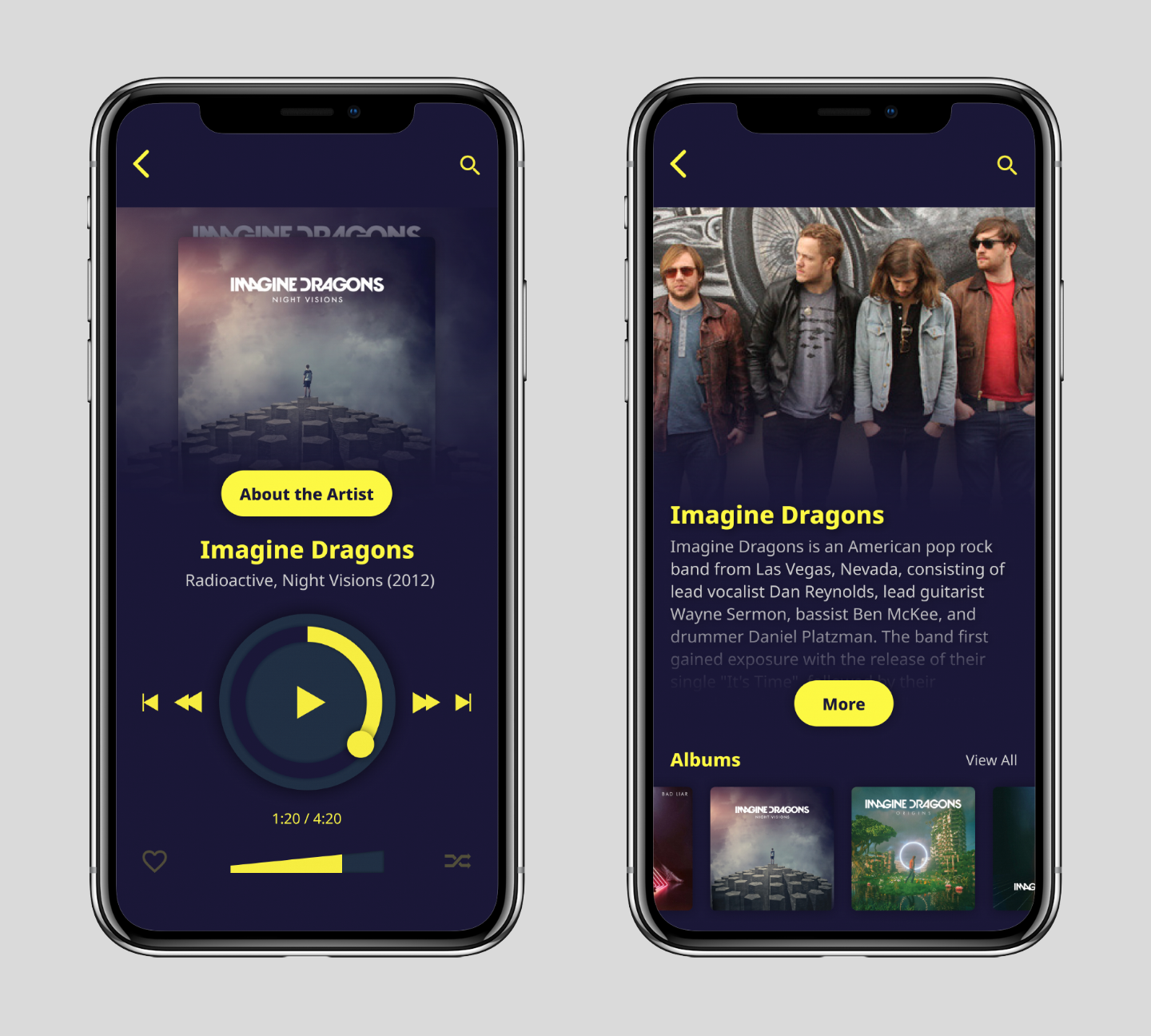
Placing the volume bar at the bottom of the control screen instead of somewhere is a design choice that I made because adjusting the volume is something people do a lot and they need easy access to this control. It's at the bottom of the page because it's closer to the thumbs and easier to reach.Music fan find it boring to scroll through just a list of text about songs or albums. I decide to incorporate large images of albums and songs as much as possible in the design and use them as interactable elements that the user can scroll through when they are looking for their favorite songs or something new to listen to. The large size of the image also makes it easier and quicker to interact with.
The Outcome:
The app design appears to address the concern mentioned in the original problem such as small and frustrating interactable elements, but more user testing needs to be done to see if there are any issues that might arise from the new design before a conclusion can be made. (Album designs and band names belong to their respective owner and are used only for layout purposes)